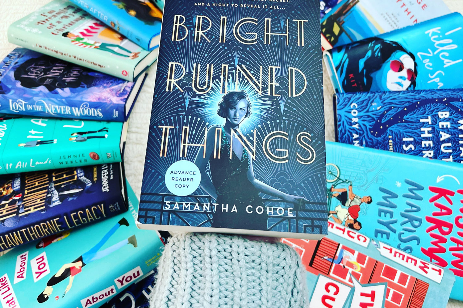
Do you sometimes wonder the tips and tricks people use to get aesthetically pleasing photos on their bookstagram? Whether it’s flat lays or books posed with people, I’ve definitely had bookstagram photo envy.
For my bookstagram, I shoot all my photos on my Iphone. However, for me, it’s all in the editing. A good edit can cover a multitude of photo sins.
Here’s my five favorite tricks to get bookstagram photos that I’m pleased with.
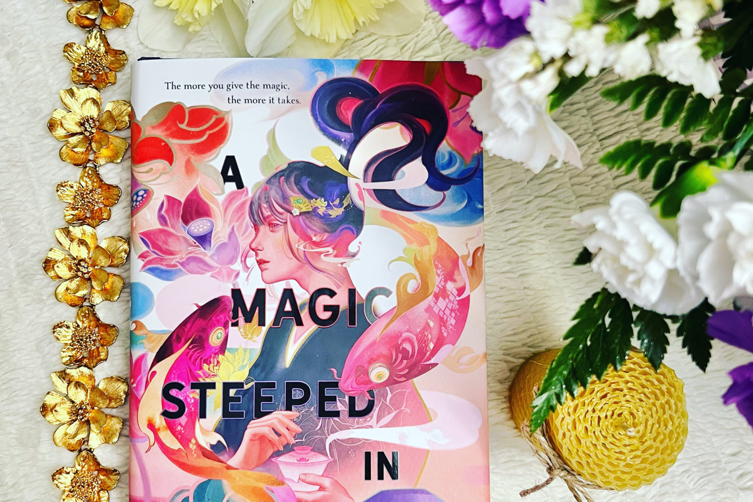
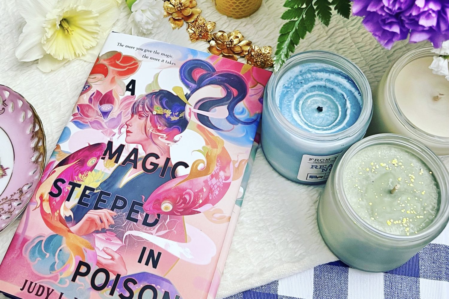
1. Angles are your friend.
While not always true, if you’re not happy with how your photo is turning out, try angling your book. Often, that’s enough to take the photo to the next level. This is especially useful for flatlays (when the photo is shot from directly overhead). There’s something about an angled object that makes the photo pleasing to the eye.
2. Don't forget the rule of thirds.

In most photography classes, the rule of thirds is the very first thing you learn about composition. The rule of thirds is a compositional guideline that breaks an image down into thirds (both horizontally and vertically) so you have nine pieces and four gridlines. Placing your subject along those lines can make an aesthetically pleasing image. It gives the eye space to wander.
Ask yourself: What are the points of interest in this photo? Is it a person or an object, such as a book? Where do you want to draw the viewers’ eye?
I’ve found it’s usually better if your subject takes up 1/3 or 2/3 of the image. Taking up half of the image can look harsh and not properly positioned to the human eye.
If you’re using a good quality camera, you don’t have to take your photos using the rule of thirds. Cropped images can look high-res enough for social media. Instead, you can experiment with different ways of cropping the image to see which ones catch the eye the most.
The rule of thirds is a simple way to make your photos visually appealing.
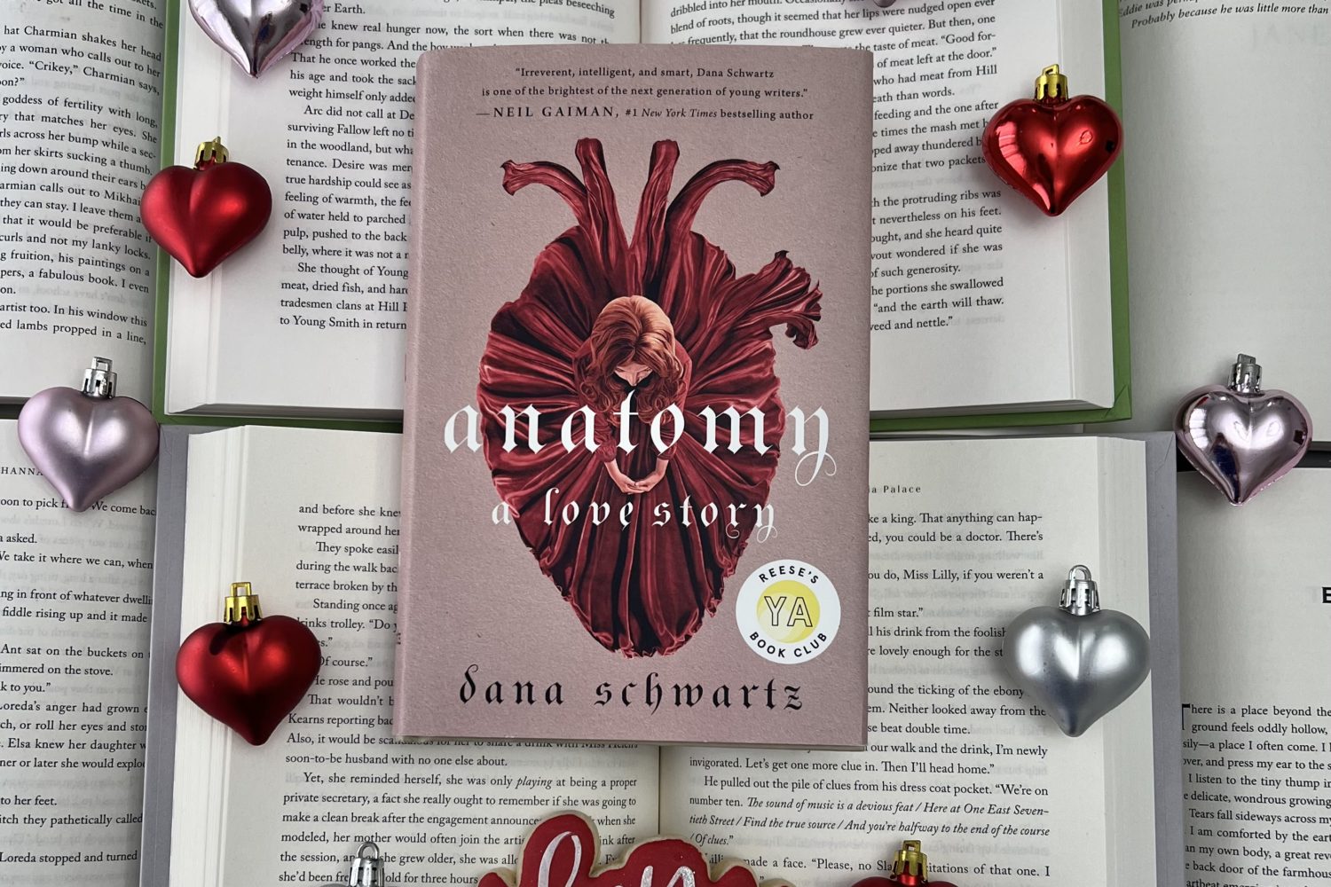
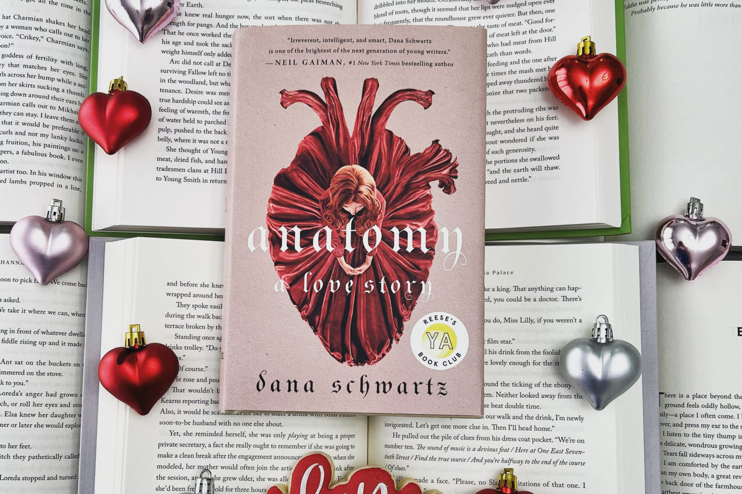
3. Banish Shadows.
 This is easy to do with an Iphone as long as your photo is decently well-lit to begin with.
I simply click edit on my Iphone and scroll through the settings until I find shadows. I usually move it up to at least a 50 to get rid of as many shadows as possible without losing too much of the photo’s original coloring. I do this before I apply my filter to give it a bright, shadow-free start.
Then it’s ready for whatever filter you like to use. Since I’m aiming for bright, light-filled pictures, I frequently use either the Clarendon or Lark filters in Instagram itself to finish it out. For me, I want to make sure my whites pop and my photos appear well-lit with no unwanted shadows.
4. Portrait mode isn't just for people.
Most of the time, if I have a book propped up, I’m shooting in portrait mode on my Iphone. It blurs out the background and gives it a professional touch. It’s one of my favorite tricks for photos.
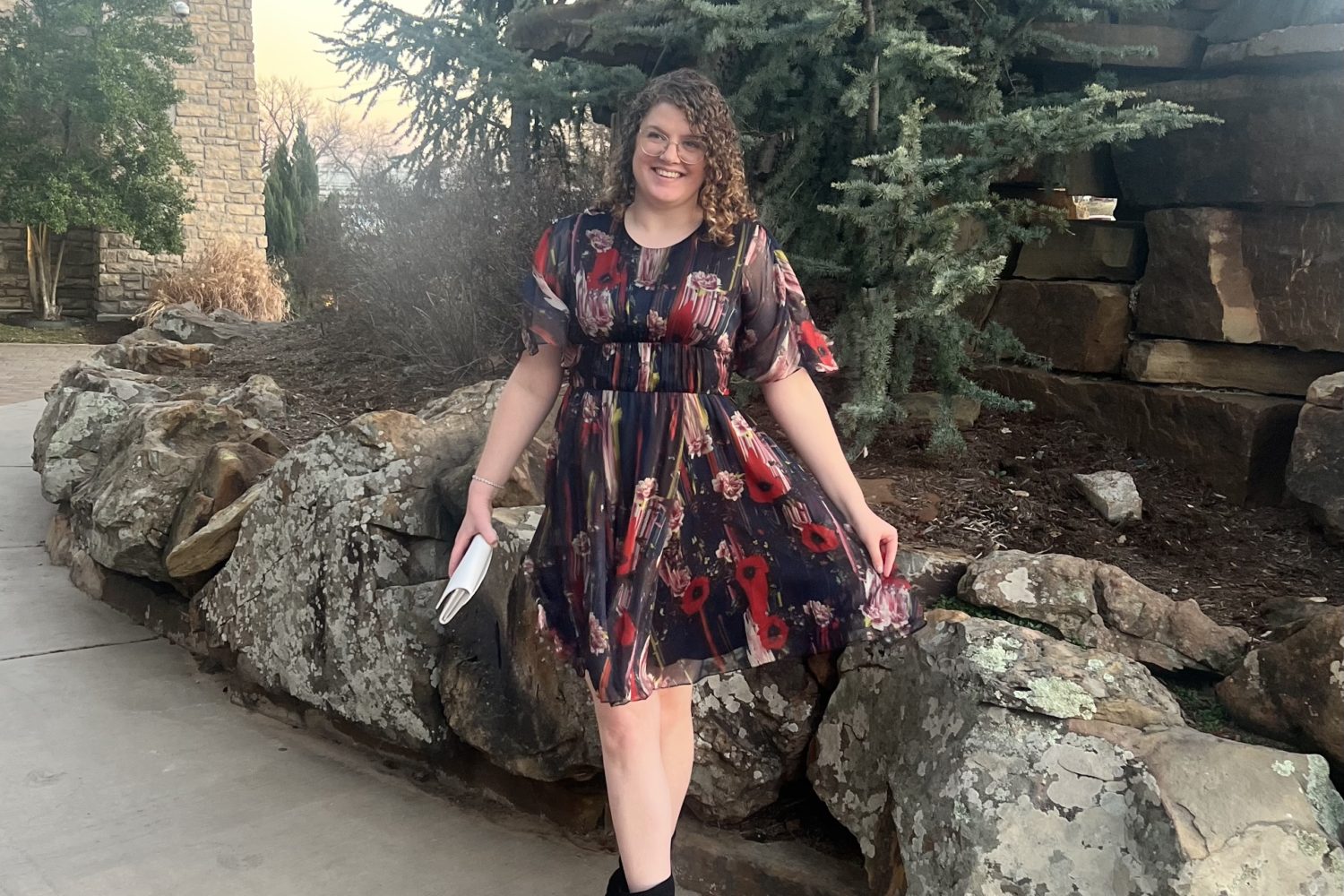
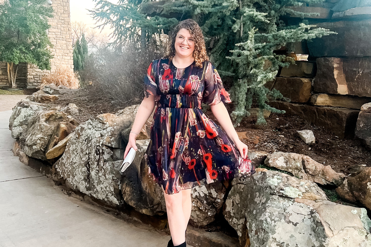
5. Lightroom can brighten any photo.
Sometimes, a photo needs more help than you can give it in the Iphone photo editor.
If I have people in my photo, I don’t use the Iphone shadows trick I mentioned above. Instead, I have Lightroom downloaded on my phone. You can edit the photo yourself in Lightroom, but I love some Lightroom presets that I have. They are free from Jenna Kutcher, but you do have to give an email address. (And, no, this isn’t sponsored, lol, I just really love her free presets!)
I used one of her presets on the photo above. They give my photos that natural, well-lit influencer look.
